Interior designer Esther Dormer(link is external) sought to give an old space a new life. She bought a dilapidated unit in an abandoned, 80-year-old building in Pittsburgh in March 2020, recognizing the potential in its stunning cityscape views and desirable location near restaurants and shops. Dormer spent last summer rehabbing the place during the COVID-19 pandemic.
Every room in the house needed work. The home originally had a bathroom with a tub sitting on a pile of rocks, a kitchen in the basement that was no longer operable, and a second floor with a bedroom and a closet that desperately needed some TLC. Take a look at what Dormer was facing before her design overhaul:
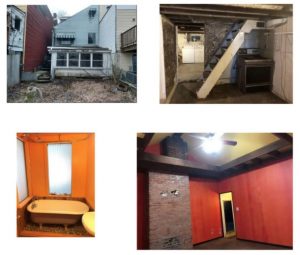
Dormer designed a new floor plan for the 600-square-foot home, including moving the kitchen out of the basement and adding an extra bathroom. She also wanted to put more emphasis on the home’s views, creating a focal point around a large back window that looked out onto the deck. To create luxury and warmth, she honed in on accessories and attention to detail by adding sconces and whimsical rugs for a modern pop.
Dormer completely renovated and redesigned the home from the ground up.
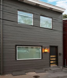
Dormer Exterior After
(Photos courtesy Esther Dormer Design)
Here are some of Dormer’s favorite elements from this home renovation:
Mirrored Tile
Dormer added mirrored tile to give the space a more open and luxurious feel. To balance the high-gloss impact, Dormer incorporated pallet wood. She originally had three lights over the kitchen table, but she thought it looked too cluttered. So, she swapped them out for one large wooden light.
(Photo courtesy Esther Dormer Design)
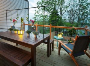 Glass Railing
The exterior deck overlooks views of the city. Dormer used a glass railing so the views would remain unobstructed. The wooden table is decorated with greenery to tie in more of nature.
(Photo courtesy Esther Dormer Design)
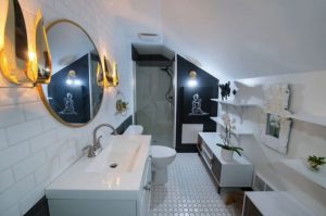
Layered Lighting
Dormer layered in the lighting to add texture, style, and illumination. There are five different lights in the bathroom. She kept the walls white—except for a smaller accent wall—and added in gold accents. The black flying pig on the shelf was “just a fun, whimsical element to complete the look,” she says.(Photo courtesy Esther Dormer Design)
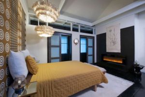
Fringed Lights and Wall Mural
Wanting the bedroom to feel luxurious, she used fringed chandeliers and added a wall mural behind the bed to make them pop. The polka dot wallpaper adds an element of trendiness and makes the room look like an abstract painting, she notes.
(Photo courtesy Esther Dormer Design)
“Copyright National Association of REALTORS®. Reprinted with permission.”

