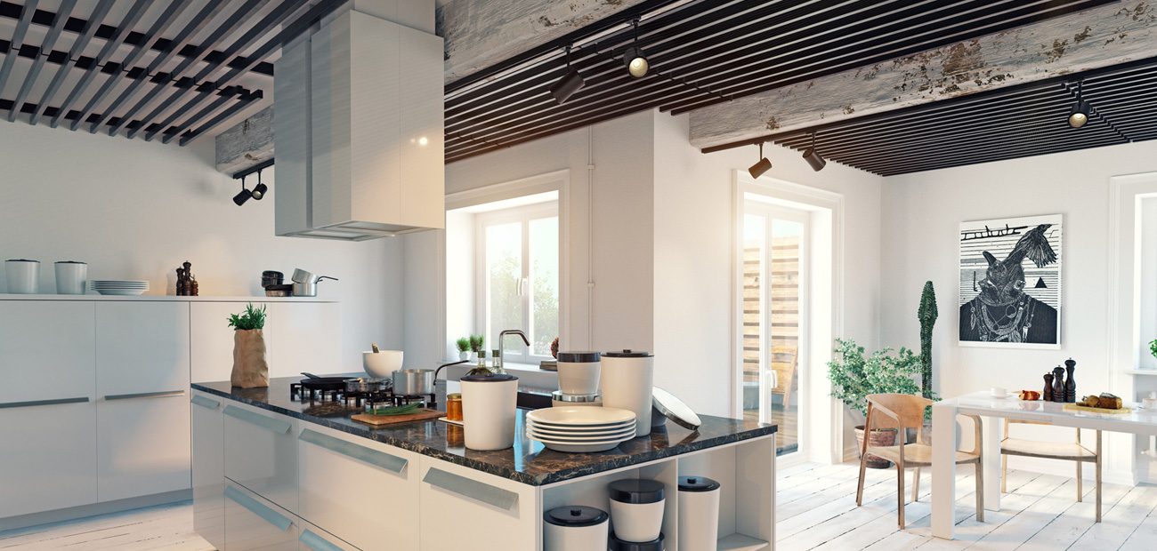
Ceilings are too often the plain Jane element of a listing, but this element of your listing’s structure can assume a starring role and transform a space with minimal effort and expense. Learn about your clients’ options, from millwork to lighting, different shapes, paint, and even wallpaper.
These days interest in personalizing space has meant ceilings have begun to play a role in helping rooms take on different personas, create memorable impressions on buyers, and solve problems such as adding visual depth to a low room.
Lisa Pickell, president of Orren Pickell Building Group, custom home builders in Chicago, is a fan of maximizing ceilings. “They offer a great opportunity to extend and enhance an aesthetic,” she says. But she also recommends doing so when planning a room’s décor rather than as an afterthought, which can make the project more expensive.
Erin Powell, design director and principal at RoOomy, an online staging firm out of San Jose, Calif., concurs that a well-planned ceiling treatment can help a listing stand out. “It usually won’t make or break a purchase, but it opens up the chance to make a buyer more interested,” she says.
Here are five ways to showcase a ceiling. Use them sparingly—certainly not in every room—to avoid visual confusion. “Otherwise, the concept may lose its specialness,” Pickell says.
Paint
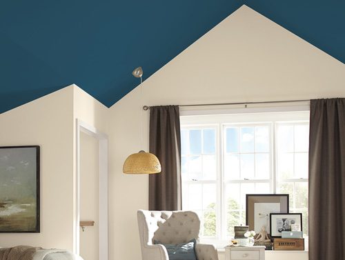
This is the least expensive way to make a ceiling stand out and alter its look without major architectural change. New homes often feature the same white color on walls and ceilings, but broker Matt van Winkle with RE/MAX Northwest in Seattle recommends painting the ceiling slightly lighter than what’s used on the walls to add depth. Generally, he advises steering clear of bold colors, except in children’s rooms.
Others, however, like adding more color for different visual effects. Designer Rebecca Pogonitz of Go Go Design in Chicago likes to use darker colors to create a cozy, almost a cocoonish, feeling, which she sometimes pairs with white trim to keep the overall feeling from seeming too heavy. Kristie Barnett, founder of The Decorologist in Nashville, also likes dark choices when staging a home for a memorable impression.
Sometimes, a wildly unexpected hue can be the easiest way to update a room, which was the approach architect Anik Pearson took with a vintage New York apartment that had its footprint and bones intact. “We restored it to its glory but with a modern twist by painting the dining room’s walls and beams a bold teal, filling in the space between beams in white, and running some chinoiserie-inspired wallpaper all around,” she says. Bob Zuber, partner, principal, and head of architectural design at Morgante Wilson Architects in Chicago, finds that tinted Venetian plaster warms up ceilings.
For the best coverage and less splatter, Rick Wilson, director of product information at Sherwin-Williams, stresses the importance of using quality ceiling paint. His colleague Sue Wadden, director of color marketing, suggests going with flat or matte finishes to hide imperfections and produce a polished, clean look for any color choice. Otherwise, painting the ceiling is no different from painting walls.
Wallpaper
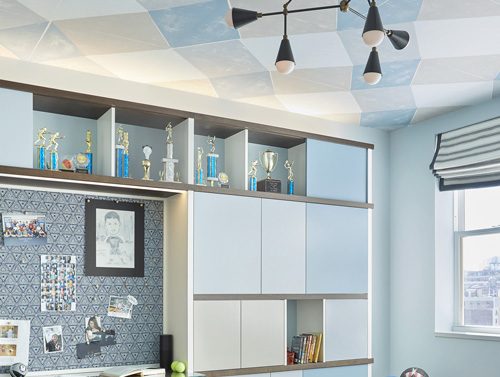
While many see this option as something of a throwback, wallpaper has found favor among more design professionals of late and for multiple reasons. “A graphic paper can define an activity area in an open-plan space; colorfully patterned papers can pull together a palette in a room, and gold, silver, or pewter leaf paper, which we use often, add stature, drama, and radiance when coupled with the right kind of lighting,” says Chicago-based designer Jessica LaGrange. “Wallpaper can hide cosmetic blemishes or introduce pattern in rooms where all the walls are taken such as a kitchen or family area with copious cabinetry.”
Pogonitz, who likes using bold and detailed patterns on ceilings, says it’s important to do the same prep work as you would for any wall surface—”patch and smooth out the ceiling as needed.”
But many design pros offer caveats with this approach. Powell cautions that wallpapering both a ceiling and walls can look excessive, so she recommends covering one or the other. LaGrange warns against using paper with a definite directional cue, such as those with a clear top and bottom, since it won’t be read “correctly” from a visual standpoint.
Barnett, who trains stagers, suggests avoiding wallpaper on the ceiling when selling. “It’s so taste-specific and many are still scared of paper,” she says. One way to hedge bets is to suggest one of the newer easy-to-remove papers from sources like Chasing Paper.
Shape
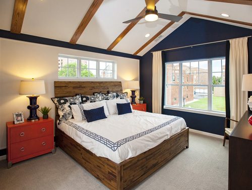
Ceilings don’t have to be a flat plane, though it’s certainly easier and less costly to make this decision before construction or during a major remodeling and in a one-story space. Van Winkle has found coffered ceiling treatments are attracting a lot of attention these days among consumers. That could mean a pitched, vaulted, or arched shape that rises upward and provides a greater sense of airiness, drama, and light.
Homebuyers who purchase townhomes in communities developed by Chicago-based Lexington Homes are increasingly requesting to upgrade to ceilings with volume, particularly tray designs in master and secondary bedrooms, says sales director Todd Lesher. “Ceiling upgrades are one of the most common selections we encourage buyers to make, as they do not add a lot of cost, but make a big impact,” he says. “Buyers like that the volume helps open up the space and make the rooms seem larger and more expansive.”
Key to adding any volume to a ceiling is carefully considering the relationship of the elements to the size of the room to maintain proper visual scale, says Zuber. “You never put a tall ceiling in a small space or a short ceiling in a large room,” he says.

Millwork
Woodwork is used for all sorts of interior spaces—doors, floors, walls, and the trim detailing that’s used in crown molding at the top by the ceiling. Such architectural trim, especially when wider and thicker, makes a house look more luxurious, says Barnett. It can also be used in more elaborate ways, atop a ceiling in recessed grids for a coffered effect or in one large central portion that’s recessed and higher, in what’s called a tray design. Merritt, in Mentor, Ohio, often designs these complex arrangements of wood in clients’ homes. The company recently fashioned an elaborate grid pattern from American white oak for a large Hamptons, N.Y., home. Haver and Skolnik Architects, in Roxbury, Conn., known for building and renovating traditional homes, frequently uses beams and other millwork to add coziness and an aged character. And Pearson recently used millwork to define an area in an open-plan New York apartment and baffle sound. In an adjacent kitchen, she added trim to bring extra drama to a skylight.
But simpler uses of crown molding or ceiling trim can achieve effects such as unifying adjoining rooms for less than $1,000, says Julie Whitley, director of architecture design at homebuilder Red Seal Development Corp. in Northbrook, Ill. One DIY technique that’s attracted wide attention and adds an updated farmhouse feel is to use shiplap, basically manufactured boards with grooves that fit together snugly. The look picked up steam after celebrity TV couple Chip and Joanna Gaines of HGTV’s “Fixer Upper” show began using them in countless projects, including on ceilings. For a more modern vibe, Zuber of Morgante Wilson Architects recommends trim with an angled or slanted profile rather than straight rectangular boards. He advises keeping millwork in the right proportion to the ceiling’s height. “Four-inch crown is good for an 8- or 9-foot ceiling,” he says.
Whether the millwork is left natural or painted should depend on how much homeowners want it to stand out or complement a certain period or style. Winkle recommends keeping millwork white, which makes it easy to live with over time and appeal more universally, especially to buyers. For traditional homes, however, Powell favors dark hues that more readily reveal texture. But she cautions that going dark can visually bring a ceiling down.
Lighting
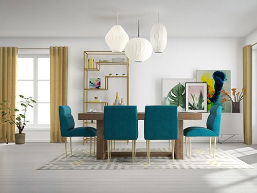
Ceiling lights have changed a great deal in recent years; even housings for recessed cans reflect trends with different trim colors, materials, and diameters. Zuber likes placing them strategically around a ceiling rather than peppering a line of cans in the more common shotgun approach. Some also suggest eschewing the expected fixture at the center of a room, particularly in dining and master bedrooms, which gives greater flexibility when arranging furniture, says Amber Shay, national director of design studios for Meritage Homes, a Scottsdale, Ariz., builder of single-family homes.
In general, oversized fixtures are more on trend, along with ceiling fans with lights built in, and almost all bulbs are LEDs for better performance, greater efficiency, and new smart-home applications, says Joe Rey-Barreau, an architect, lighting designer, and education consultant for the American Lighting Association. Among some of the new LED uses are in linear strips that can be installed easily inside or on top of cabinets, in bookshelves, along toe kicks in kitchens and baths, and in ceiling coves and cornices. For sellers who want to update fixtures before listing to improve how rooms show, Rey-Barreau says the number of attractive, affordable options has increased. That’s especially helpful if they must leave such upgrades behind, which of course depends on the sales contract.

